Putting Website Accessibility Plug-ins to the Test
School website accessibility is a growing concern for schools and districts. Many school webmasters are turning to third-party plug in tools to evaluate the accessibility of their websites. But how easy is it to interpret these reports—and how consistent are they? Let's take a closer look.
A Non-Expert's View of Accessibility Reporting Tools
Here at eChalk, we're proud to have website accessibility experts on staff. I am not among those people.
I'm the Marketing Director at eChalk, and while I'm not a novice when it comes to building and maintaining websites, I'm not a web developer. I just know how to use my CMS to get my job done. In other words, I probably have a similar skill set to many school webmasters when it comes to website management.
So what happens when someone like me tries to use accessibility evaluation tools? I looked at several top school and district websites using two of the most popular Chrome plug-ins:
The challenge? To see how useful these common plug-ins would be for a non-expert like me. Specifically, I wanted to know:
Could I understand what the reports were telling me?
How much consistency is there between the different reports?
Would I know how to fix the issues the reports identified?
Evaluating the Accessibility Evaluators
The website I chose to evaluate was picked randomly from a third-party list of "Best District Websites for 2018." And it is indeed a great website! Well organized, lots of great information, nice design. But how will it stack up with our accessibility checkers?
WAVE
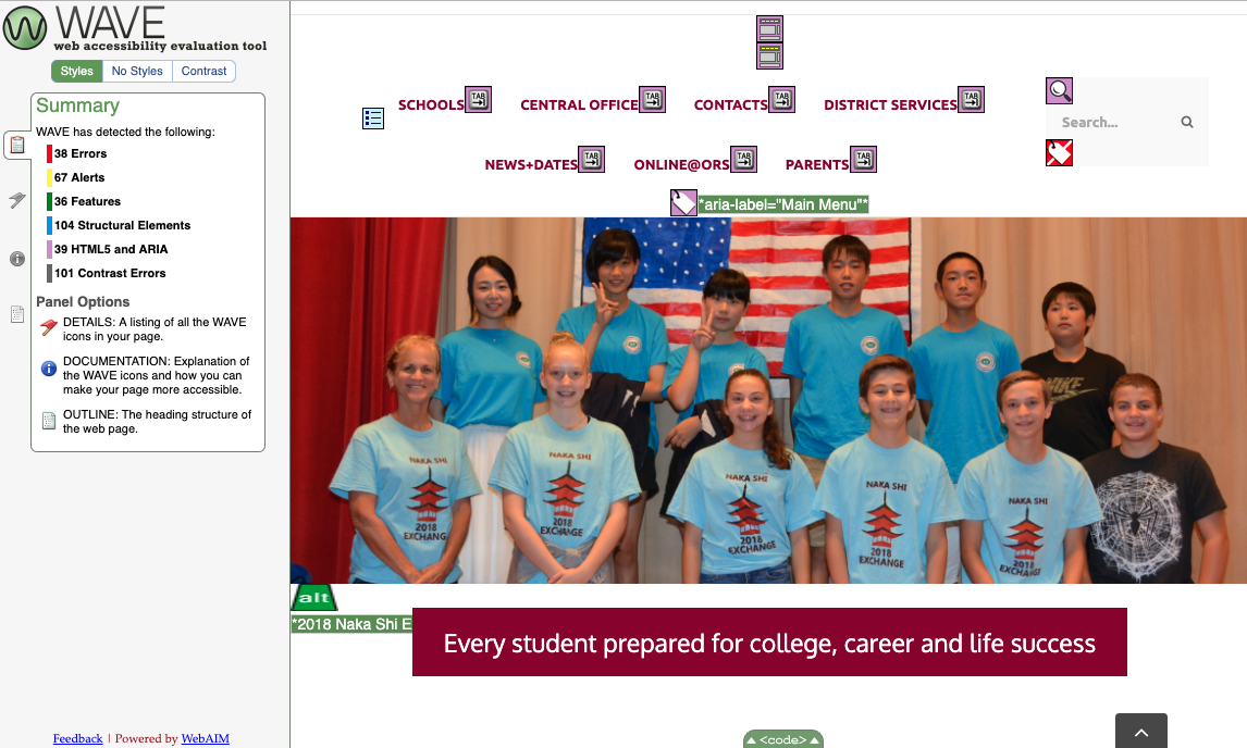
The first one I tried was WAVE, and it gave me a totally different perspective on the site. 38 accessibility errors, 67 alerts, 101 contrast errors…clearly, the site was not as user-friendly for visitors with visual, auditory or mobility differences as it appeared to my non-trained eye. Note – I don’t mean to criticize or embarrass this school (I blocked out the name in screen shots). It is a nice site and many schools have similar accessibility issues. I just needed a relevant site to experiment with!
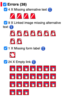
So let's dig a little deeper. What is this report telling me? First the errors:
OK, missing alt text…I know what that is, and I know how to fix it. So far so good.
But where's the missing form label? I can't seem to find it on this page.
And what are all these empty links? The links look fine to me—what's wrong with them?
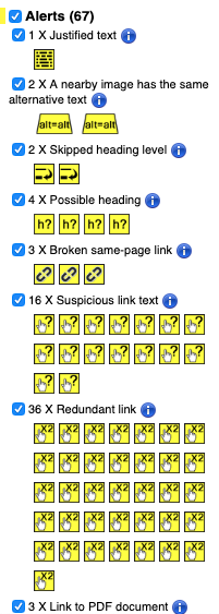
Moving on to Alerts. These are issues that WAVE thinks may be problems, but require additional review by a human to verify whether or not they are really problems.
Fixing the text justification and alternative text issues sound fairly straightforward. Same with the broken same-page links. But what about the heading issues…I can't really see what they mean here without looking at the source code. And what does "suspicious link text" mean? What makes it suspicious? Why are redundant links such a problem? And what do I do about those PDFs—what if I need that information to be easy to download and print?
Let's take a look at the source code to see if that tells me anything more useful about these potential problems:
Actually, on second thought, never mind. I have no idea what to do with the source code.
As I look through the rest of the WAVE report, I find myself getting more confused.
"Features"—that's the stuff I've done right. Yay! So I'll skip over that part. Good is good, even if I don't know why it's good.
Structural Elements: This appears to be evaluating the header structure that shows how the page is organized. I have 104 structural elements. Is that good or bad? What about the 83 unorganized lists—are unorganized lists something I should be avoiding? Is there something I need to fix here, or is it just giving me basic information about the structure of my page?
HTML5 and ARIA: I know that that these are important for people using screen readers, keyboard navigation and other assistive technologies. I have no idea whether this page is good or bad in this area based on this report. Eight ARIA tags, 5 ARIA labels, 19 ARIA tab indexes…do I need more? Are any missing? How do I know?
Siteimprove
How does this report compare to other accessibility evaluation tools? Here's what Siteimprove tells me:
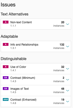
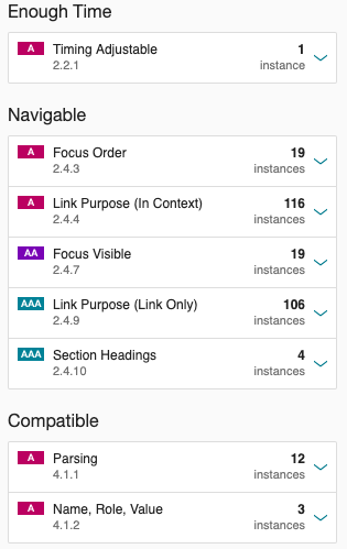
This report looks completely different—and it has picked up different things. Evaluating the exact same page, it finds 11 images with no alt text, where WAVE identified four. Siteimprove found 19 places where the color contrast was insufficient, and WAVE found 101. Siteimprove tells me there is no top-level header on the page, but WAVE has identified the H1. Which is correct?
Let's take a closer look at one of these categories, "Adaptable":
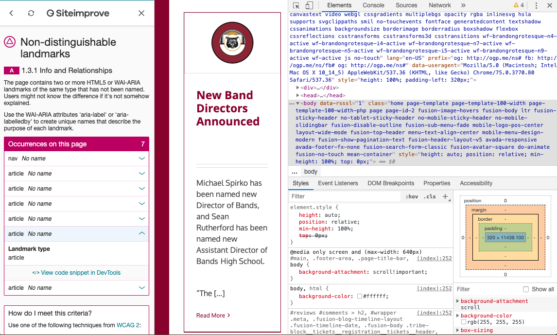
This appears to have something to do with ARIA landmarks. But I'm not sure what to do with the information. Nor am I entirely sure how to figure out where the error is on the page.
When I click on the webmaster tools icon, it instructs me to open DevTools, which brings me back to the HTML code. I do not know how to fix the identified error from the code.
The Verdict: Accessibility Plug-ins Are Not Easy To Use For Non-Developers
Looking at the reports, several issues became clear:
The results are not consistent between the tools. This makes it hard for me to know which report I should trust when evaluating my website.Do I have a header issue or don't I? Do I have four images missing alt text or eleven? How many of the "errors" and "alerts" identified are genuine problems? A human who understands accessibility issues must review and evaluate each of the identified issues and verify whether or not an accessibility issue exists. I am not that human.
The reports are hard for non-developers to read and understand. Of the tools I tried, I found WAVE's reporting format to be by far the easiest to understand. But I struggled to interpret the information in both of the reports. What are ARIA tags and tab indexes? What do "focus order" and "parsing" mean, and what do they have to do with accessibility? Much of the information in these reports is still a mystery to me.
It is not clear how to fix the identified issues even when I do understand them. Some issues—like alt text for images or missing form labels—seem pretty straightforward to find and fix. For others, I struggled to match the alert with the exact location on the page. And for most, even if I could find the issue, I didn't know what steps to take to address it. Do I need to change something in the source code? Can I fix the issue in my CMS? Would making the change break something else on my site? I have no idea. These tools do not distinguish between content issues (which I have control over) and platform issues (which I most likely do not).
It does not tell me how my web site stacks up against industry averages and expectations. Perhaps the most frustrating aspect of the evaluation is that I have no idea whether the site is "good" or "bad" from an accessibility standpoint. The vast majority of websites have at least a few accessibility flaws, and the Office of Civil Rights does not expect 100% compliance with school website accessibility guidelines. What they do expect is that schools and districts have made a good faith effort to make information and resources on their websites accessible to as broad an audience as possible, and are committed to improving accessibility over time. Without knowing more about the seriousness of the identified issues and the importance of the information that may be inaccessible, I can't really evaluate the overall accessibility of this site.
That's not to say that these tools don't have value. A web developer with a deep understanding of website accessibility and WCAG 2.0 guidelines will no doubt find them very useful and perhaps necessary for site remediation. Someone with this skillset could evaluate each alert to determine whether or not there is a genuine problem and take the necessary steps to correct them using CMS tools or by making changes in the source code. Unfortunately, most schools and districts do not have coders and accessibility experts on staff.
Having gone through this process, my advice to you is: experiment with these tools (they are free and available at wave.webaim.org and siteimprove.com). They do provide valuable insights into the overall accessibility of your site. But to really address these issues, most districts will have to engage the services of an expert. Alternatively, schools and districts can choose a CMS platform that is highly accessible and that has built-in tool to surface the critical (and fixable!) content issues that arise as content creators in your school build and add to the site.
eChalk Guide: An Easier Way to Evaluate School Website Accessibility
That's why eChalk is introducing a new tool to help our customers evaluate their eChalk websites. eChalk Guide (coming this summer!) is a built-in accessibility reporting tool for eChalk sites. It provides simple, clear and actionable accessibility reports for each webpage.
Crucially, Guide surfaces only the issues that are within the control of the content creator.These include content issues such as missing alt text for images, inaccessible PFDs, misused headers, and other issues that are the responsibility of the content creator to fix. It does not clutter the report with platform or design issues that the content creator does not have the power address. In fact, the eChalk CMS is itself built to minimize or eliminate these platform issues, so all webmasters need to worry about is the accessibility of the content itself.
With Guide, our users will get:
Site Report: Allows webmaster to see content issues on all pages across the site.
Page Report: Allows content creators (webmasters, teachers, coaches—anyone adding content to the site) to see any accessibility issues on a page BEFORE they publish it, limiting the creation of new accessibility issues.
Look for more information about eChalk Guide over the next few weeks. In the meantime, if you have questions about school website accessibility, please contact us! We’re building tools to make website accessibility easy for K-12 schools and districts.
