Creating Outstanding District Homepages

“The Home page is the waterfront property of the web: It’s the most desirable real estate, and there’s very limited supply.” Paul Krug, Don’t Make Me Think
Your district’s home page is critically important. It conveys your district’s culture and mission, houses news and events, and provides key information to your community. Get the home page right and it will do a tremendous amount of work for you. Get it wrong and it will frustrate visitors and detract from the district’s reputation.
In a previous post we discussed the process of developing navigation for your district site that is “MECE” - Mutually Exclusive and Collectively Exhaustive. Theoretically, with well-designed navigation, all of the information that a visitor might need is available and easy to find. So what is the purpose of the homepage?
Building Your District Image
The first job of the home page is to convey image: the homepage should communicate the district’s unique character, mission, and direction. A visitor should immediately have a sense of what makes the district special. This is important whether the visitor is a parent, a current or prospective teacher, a taxpayer, or a student.
Image is communicated best through photographs and video. One district that does this well is The School District of South Orange and Maplewood, which features a well-produced slideshow of student paintings, sculptures, dance troupes, and choruses. A visitor immediately gets the sense of a diverse student body, a caring atmosphere, and an emphasis on the arts. Another is the home page for Charles Drew Charter, which conveys Drew’s focus on achievement, its extraordinary facilities, highly qualified staff, and STEAM focus.
To convey your desired image, use bold pictures or video and make sure they are well produced (it matters!). Refresh them from time to time – at least once a semester. Don’t use too many of them; one video or three or four images will do. More than that can look cluttered and disorganized. Make them interesting: one eChalk district produced a funny, positive music video featuring the Superintendent, students, and teachers across the district—conveying energy, community, and the joy of being in school. Another district highlighted a video on the evolution of education—the move toward collaborative learning and authentic evaluation—conveying the district’s commitment to engaging and productive learning and cutting-edge pedagogy. Some schools attempt to convey mission through a lengthy letter from the Superintendent on the home page. In our opinion that belongs elsewhere, deeper in the site – few visitors read it, and once read, the long letter just takes up space.
Putting First Things First
The second job of the homepage is to surface the most frequently needed information for your key audiences. Although your navigation will contain all the information a visitor might need, some things are so important and frequently accessed they should be “bubbled up” to the home page. Think carefully about who your audiences are and what they REALLY need when they come to the website. This takes discipline; everyone wants a part of the homepage, and most district homepages are cluttered with nice-to-have, but not critical, information.
From XKCD. A similar Venn diagram could be made for K-12 district homepages.
In our experience at eChalk, the items that merit a place on the district home page include:
Universal links and information: There are six items that should appear on almost any district homepage which are relevant to almost any visitor. These are:
- Logins to universal applications such as email, SIS, and LMS (often image links in the header)
- Search (often placed in the header)
- Calendar (often a link in the header AND a content section in the body of the home page)
- Social feeds (or social links in the header or footer)
- District news (a feed of announcements)
- Contact and directions (should be in the footer)
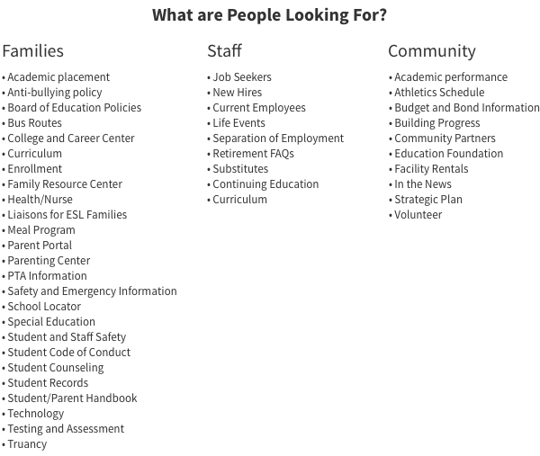
Group-specific information: Each of the district’s three key constituents – families, staff, and local community – has a specific set of information needs (we don’t include students as a key constituent for the district site, as students will visit their school’s website for information, not the district’s). You can create quick link lists on your homepage for each of these groups. Parents’ information needs are the broadest, and span almost every department at the district. If the list of key information is too long and the quick links list becomes too large, create a quicklink on the homepage to a parent landing page, where you will have space to lay out parent-specific information.
If your district’s website employs MECE navigation and has a home page that both conveys your district’s unique identity and provides quick access to the most critical for your key audiences, you’ll be ahead of 90% of the district websites out there.
Which is not to say the rest of the site doesn’t matter! In future blogs, we will look into some of the key interior pages and see how some of the best districts organize department, board, and academic information.

